Blog Post
Custom CMMS Dashboards: 7 Must-Have Views for Maintenance Management
Elevate your maintenance strategy. Learn the 3 essential features of effective CMMS dashboards and explore 7 custom views.


Key Takeaways
CMMS dashboards turn raw maintenance data into actionable intelligence by synthesizing information from work orders, asset histories, inventory, and labor hours into intuitive visual formats.
Effective CMMS dashboards require three core capabilities: real-time data visualization, customizable interfaces, and mobile accessibility for field operations.
Standard dashboards provide general awareness, while custom-made dashboards deliver the focused insights needed for specific maintenance management tasks.
These 7 custom-made specialized dashboards cover the complete maintenance lifecycle, including operational tracking, asset intelligence, resource management, and financial control.
UpKeep’s analytics capabilities elevate dashboard functionality beyond basic reporting through features such as the custom dashboard builder, AI-powered Nova for natural language queries, and enhanced asset reliability tracking.
A Computerized Maintenance Management System (CMMS) collects vast amounts of information, including work orders, asset histories, spare parts inventory, and technician hours. However, without a way to synthesize this data, it remains a dark asset.
What is A CMMS Dashboard?
The CMMS dashboard is the software's visual engine for synthesizing raw data into real-time, actionable insights. It serves as a central command center where maintenance managers and technicians can monitor the health of their operations at a glance.
CMMS Dashboards present complex information in intuitive, visual formats such as charts, gauges, trend lines, and heat maps, enabling maintenance managers and technicians to quickly assess the current state of operations and identify areas requiring attention. This way, dashboards directly influence how effectively maintenance teams can respond to challenges, allocate resources, and drive continuous improvement.
CMMS Dashboard’s Strategic Impact on Maintenance Operations
A great dashboard transforms maintenance from a firefighting operation into a strategic function that actively protects asset reliability and operational uptime.
Scheduling and resource allocation: Dashboards provide instant visibility into technician availability, preventive maintenance tasks, and work order priorities. allowing supervisors to optimize daily assignments and balance workloads.
Asset management: A visual representation of equipment health, maintenance history, and failure patterns helps teams prioritize investments and make informed decisions about repair versus replacement.
Budget control: Real-time tracking of maintenance costs, parts consumption, and labor hours enables managers to stay within budget and identify opportunities for cost reduction.
Essential Features Of An Effective CMMS Dashboard
To maximize the impact of your maintenance strategy, a CMMS dashboard must be more than just a collection of charts. It needs to be an intuitive, flexible, and accessible tool that provides the correct information to the right person at the right time.
Here are the essential features that define an effective CMMS dashboard:
Real-Time Data Visualization
Visualizing data in real time allows maintenance leaders to identify recurring failures and perform root cause analysis before a minor issue becomes a major shutdown. Instead of reacting to breakdowns after they happen, teams use live dashboards to monitor equipment conditions and identify risks.
An effective dashboard uses live data feeds to provide an instant pulse of your operations.
Interactive Gauges: Use color-coded indicators (Green/Yellow/Red) to quickly identify assets operating outside standard parameters.
Trend Analysis: Visualizing data over time allows managers to identify assets that consistently underperform before they cause a total system shutdown.
Drill-Down Capabilities: A high-level chart (e.g., Total Downtime) should allow you to click through to see the specific machines, technicians, or parts involved.
Customizable Interface
A customizable interface ensures that every user, from the technician to the CFO, sees the specific metrics most relevant to their role. Maintenance managers often need to review the daily work order backlog and technician workloads, while executives may care only about overall asset uptime and cost reduction. This flexibility prevents users from being overwhelmed by irrelevant data, a common reason legacy CMMS tools fail.
For Maintenance Managers: Their dashboard focuses on high-level KPIs such as Planned Maintenance Percentage (PMP), budget adherence, and labor utilization to inform long-term strategy.
For Technicians: Their view is task-oriented, highlighting assigned work orders, high-priority alerts, and the location of critical spare parts.
Drag-and-Drop Widgets: Users should be able to move, resize, or hide data widgets to prioritize the metrics that directly impact their daily workflow.
Mobile Accessibility For Managing Operations On The Go
Mobile-first accessibility empowers technicians to create and close work orders directly in the field, so the dashboard reflects the most current information. Because maintenance managers are rarely at a desk, a mobile app lets them see the real-time status of their operations from anywhere.
Modern mobile dashboards provide the following field-ready benefits:
Offline synchronization: Create and update work orders without an internet connection; data syncs automatically once back online.
QR and barcode scanning: Instantly pull up asset history or inventory details by scanning a tag with a phone camera.
Photo and video attachments: Capture visual evidence of equipment issues or completed repairs to improve documentation.
Push notifications: Receive instant alerts when a high-priority job stalls or a new safety event is reported.
Voice-to-text input: Use voice commands to submit work orders hands-free while working on equipment.
Learn more: UpKeep CMMS has a repository of solid, built-in standard CMMS Reports and Dashboards to set you up for success
7 Must-Have Custom Dashboards for Your CMMS
A comprehensive CMMS platform should have dashboards that address the different needs of your maintenance operations. While standard dashboards provide general awareness, custom-made dashboards deliver the focused insights required for specific aspects of maintenance management.
These 7 custom-made dashboards form the foundation of an effective maintenance software, each serving a distinct purpose in optimizing your operations.
Learn More: Create custom reports and dashboards on UpKeep Analytics
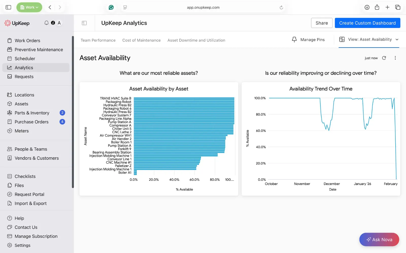
Asset Availability Dashboard
Asset availability provides the visibility needed to protect and maximize their value. This dashboard shows which assets are most reliable and if asset reliability is improving or declining over time.
Key Reports: Asset Availability by Asset, Availability Trend Over Time


Manager’s Pro tip → Build this in UpKeep Analytics
Asset Availability by Asset
Bar chart
Dimensions: Asset Name
Measures: Availability (%)
Filters: Operational Status ≠ Archived, Date → Last 30 / 60 / 90 days (manager choice)
Availability Trend Over Time
Line chart
Dimensions: Date
Measures: Availability (%)
Filters: Asset Category (optional), Site (optional)
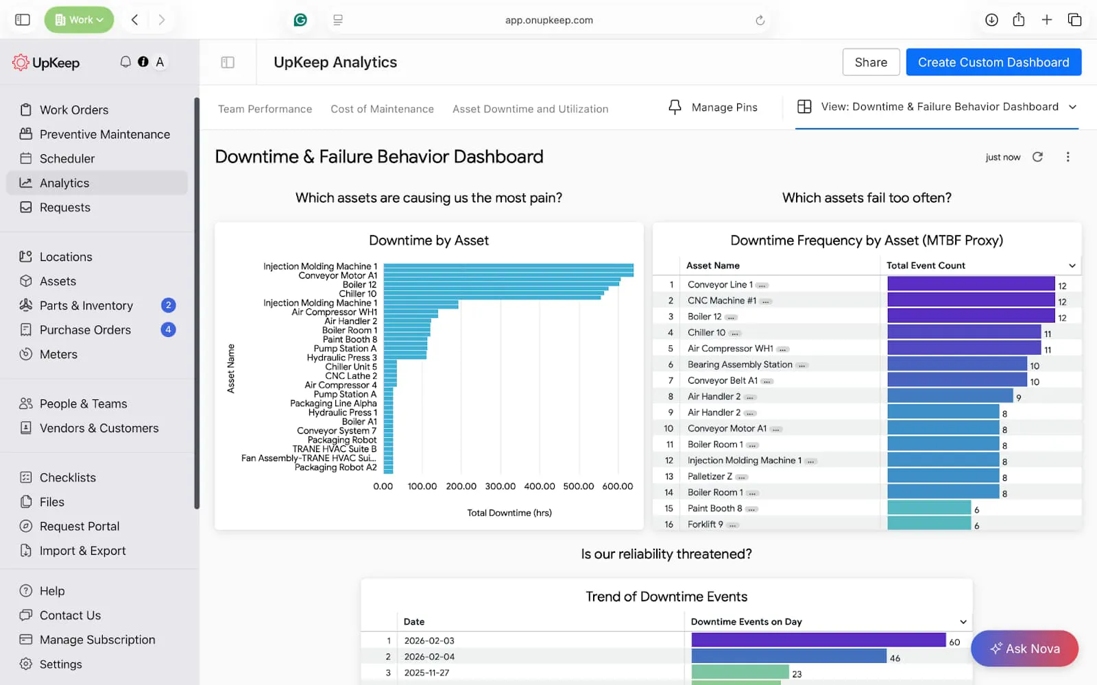
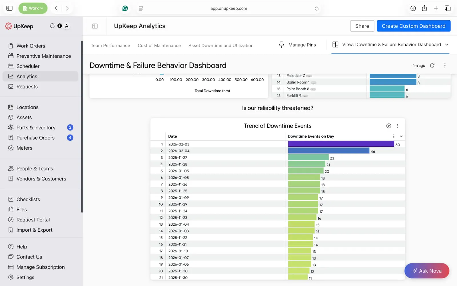
Downtime and Failure Behavior Dashboard
Availability dashboards may hide the severity of issues. This dashboard shows which assets are causing your organization the most pain, which ones fail too often, and if the reliability of your plant is threatened.
Key reports: Trend of Downtime events, Downtime Frequency by Asset, and Downtime by Asset.


Manager’s Pro tip → Build this in UpKeep Analytics
Downtime by Asset
Bar chart
Dimensions: Asset Name
Measures: Total Downtime (hrs)
Filters: Date range, Operational Status ≠ Archived
Downtime Frequency by Asset
Dimensions: Asset Name
Measures: Total event count
Filters: Date range, Manually Recorded Event = No (optional, for cleaner data)
How this acts as MTBF: Fewer downtimes over time = higher MTBF
Trend of Downtime Events
Dimensions: Date
Measures: Downtime events on day
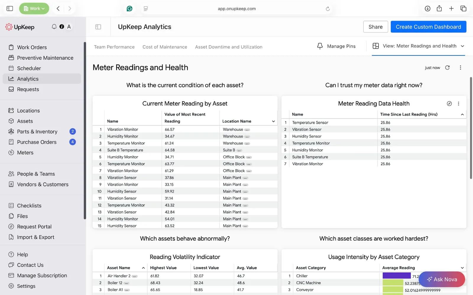
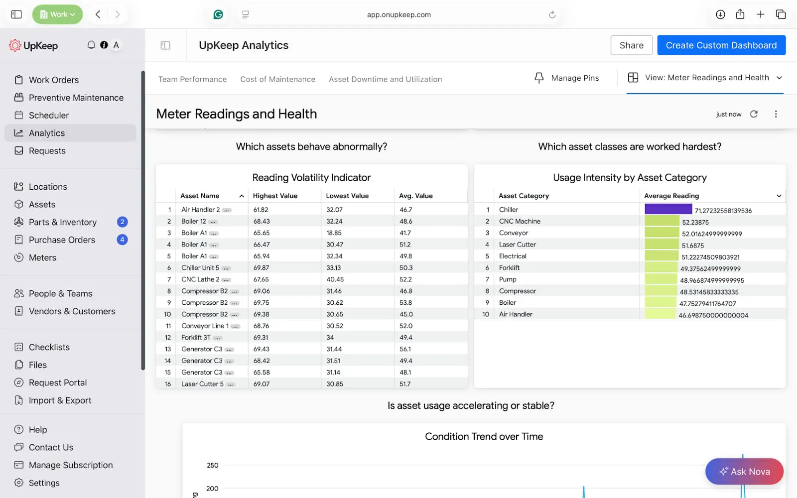
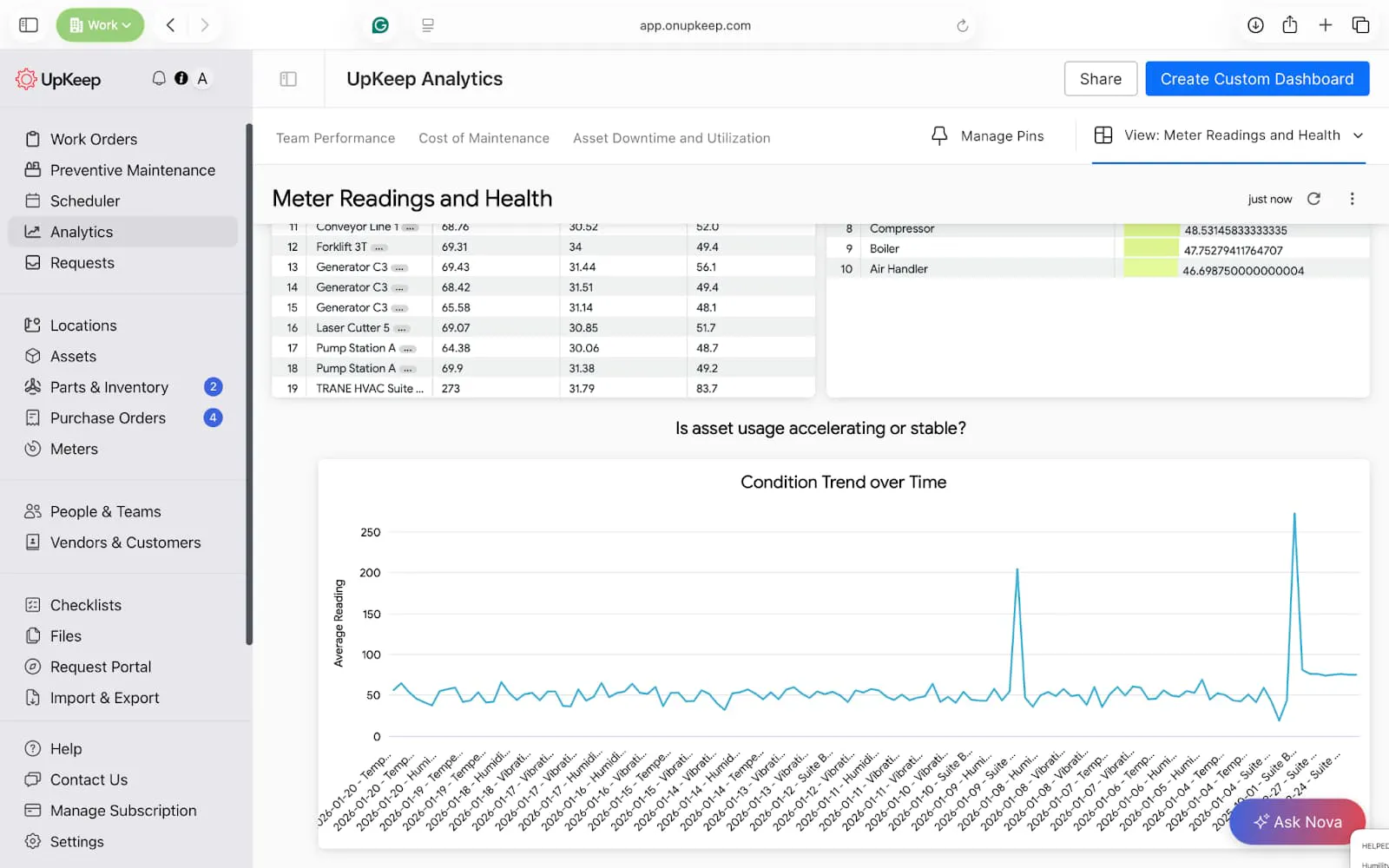
Meter Readings and Health Dashboard
The meter readings and health dashboard is custom-made to show the current condition and health of meters within your facility. With this view, you can identify dead sensors, identify unstable operations, and trigger recalibrations when due.
Key Reports: Current meter reading, reading volatility, threshold risk monitor, and condition trends over time.

Manager’s Pro tip → Build this in UpKeep Analytics
Current Meter Reading by Asset
Table
Dimensions: Asset Name
Measures: Most Recent Reading
Filters: Meter Category (runtime, cycles, energy, pressure, etc.), Site (optional)
Meter Reading Freshness (Data Health)
Table
Dimensions: Asset Name
Measures: Time Since Last Reading (Hrs)
Sort: Descending (stalest first)
Reading Volatility Indicator
Table
Dimensions: Asset Name
Measures: Highest Value, Lowest Value, Avg. Value
Usage Intensity by Asset Category
Dimensions: Asset Category
Measures: Average Reading
Usage Trend Over Time (Condition Trend)
Line chart
Dimensions: Meter Reading Date, Readings Name
Measures: Average Reading
Filters: Asset Name (single-select), Meter Id (if multiple meters per asset)
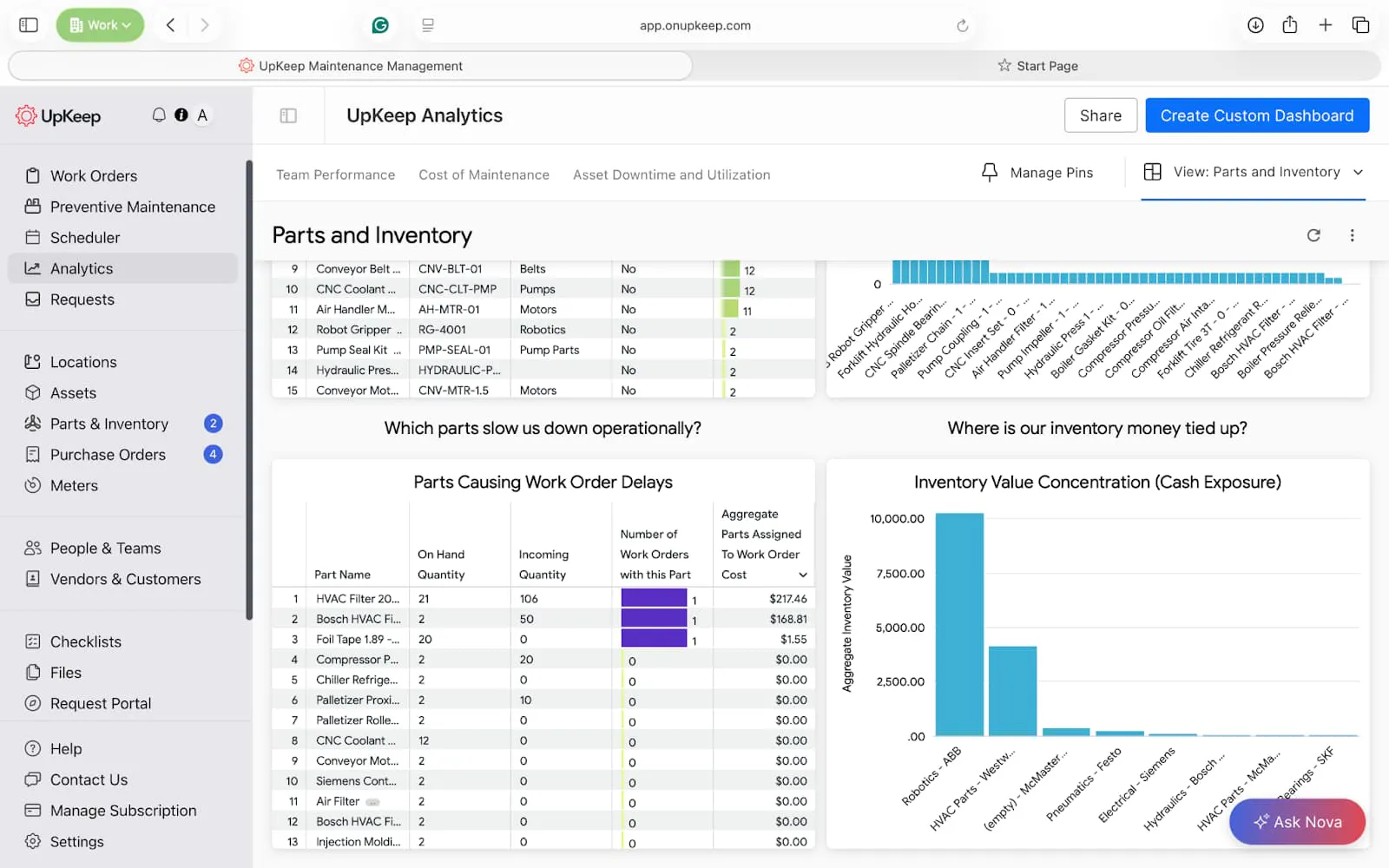
Parts and Inventory Dashboard
This parts and inventory dashboard shows an overview of parts and inventory within your facility. It can help you minimize stockouts, save money, and see parts that may affect preventive maintenance compliance.
Key reports: Stockout risk monitor, Critical Parts by asset coverage, parts causing work order delay, and Cash Exposure.

Manager’s Pro tip → Build this in UpKeep Analytics
Stockout Risk Monitor
Dimensions: Part Name, Part Category, Critical (Yes / No)
Measures: Aggregate Part Quantity
Filters: Critical = Yes: Non Stock = No, On Hand Quantity ≤ Minimum Part Quantity
Critical Parts by Asset Coverage
Column chart
Dimensions: Part Name, Number of Assets Assigned, Critical (Yes / No)
Measures: Aggregate Part Quantity
Parts Causing Work Order Delays
Table
Dimensions: Part Name, Incoming Quantity, On Hand Quantity
Measures: Number of Work Orders with this part, Aggregate Parts assigned to Work Order cost
Inventory Value Concentration (Cash Exposure)
Bar chart
Dimensions: Part Category, Part Inventory Vendor
Measures: Aggregate Inventory Value
Filters: Inventory Status = In Stock
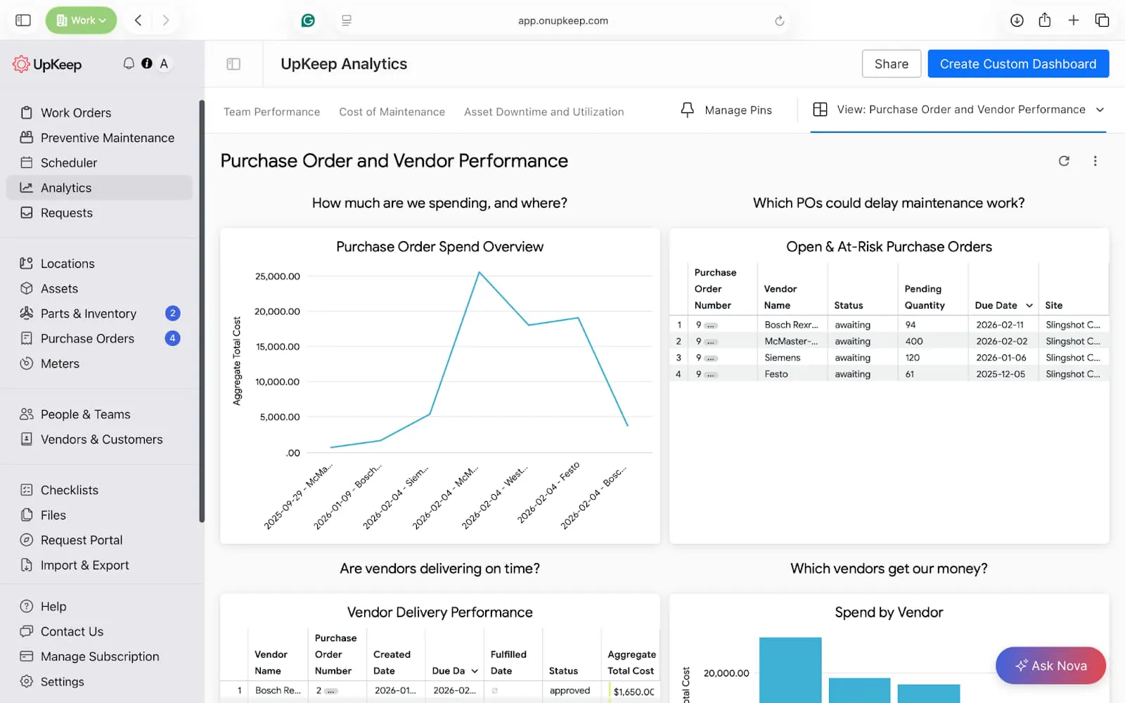
Purchase Order and Vendor Performance Dashboard
This custom dashboard looks at the performance of your vendors and pending purchase orders as you manage your maintenance operations. It helps hold vendors accountable and justify budget requests from management.
Key reports: Purchase order spend, vendor delivery performance, and at-risk purchase orders.

Manager’s Pro tip → Build this in UpKeep Analytics
Purchase Order Spend Overview
Line or bar chart
Dimensions: Created Date (or Approved Date), vendor Name
Measures: Aggregate Total Cost
Filters: Status = Approved, Fulfilled, Date range (monthly/quarterly)
Open & At-Risk Purchase Orders
Table
Dimensions: Purchase Order Number, Vendor Name, Status, Pending Quantity, Due Date, Site
Filters: Status ≠ Fulfilled, Due Date in 1 week
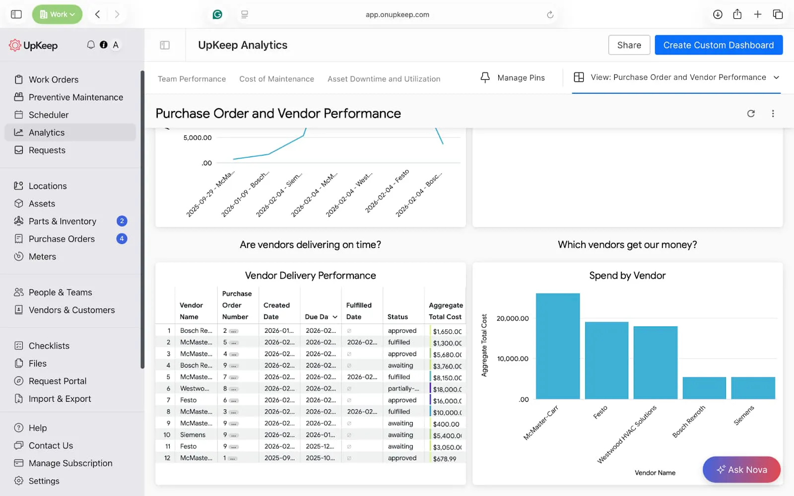
Vendor Delivery Performance
Table
Dimensions: Vendor Name, Purchase Order Number, Created Date, Due Date, Fulfilled Date, Status
Measures: Aggregate Total Cost
Spend by Vendor
Bar chart
Dimensions: Vendor Name
Measures: Aggregate Total Cost
Sort: Descending (highest spend first)
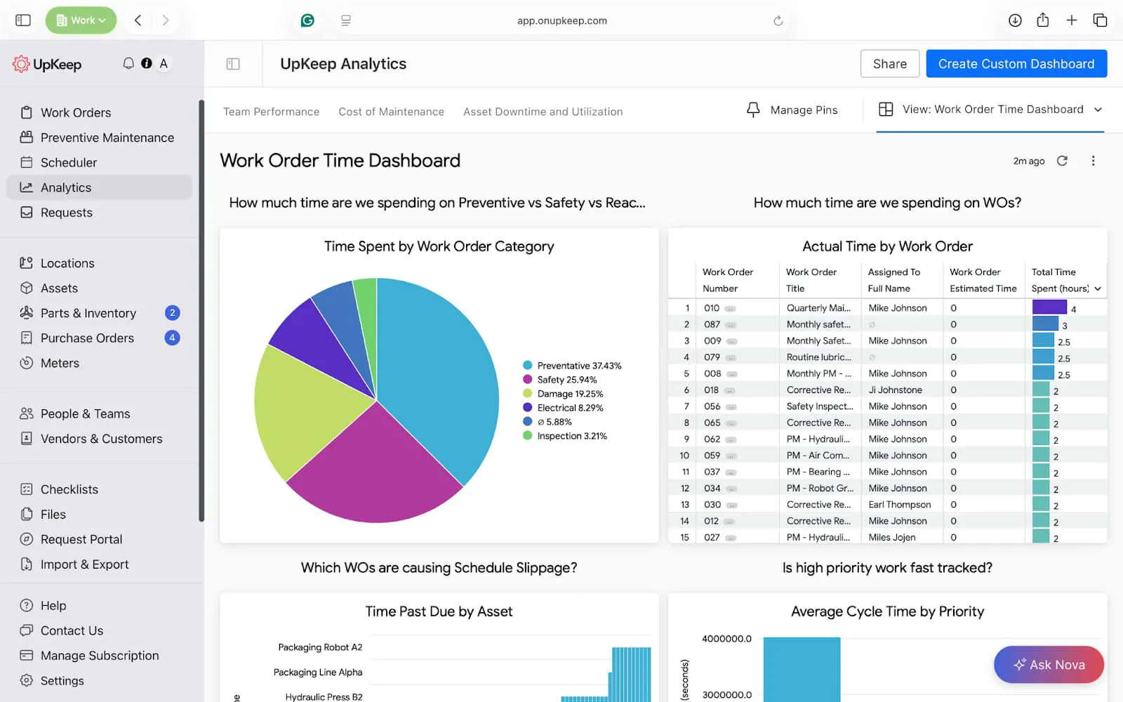
Work Order Time Dashboard
This custom dashboard shows how much time your work orders consume. You can use this tool to identify underestimation, improve planning accuracy, and highlight team training needs.
Key reports: Time spent by work order category, actual vs estimated by work order.


Manager’s Pro tip → Build this in UpKeep Analytics
Time Spent by Work Order Category
Pie chart
Dimensions: Work Order Category
Measures: Total Time Spent (hours)
Actual vs Estimated Time by Work Order
Table
Dimensions: Work Order Number, Work Order Title, Assigned To Full Name
Measures: Work Order Estimated Time, Total Time Spent (hours)
Filters: Work Order Status = Completed, Date range (Completed Date)
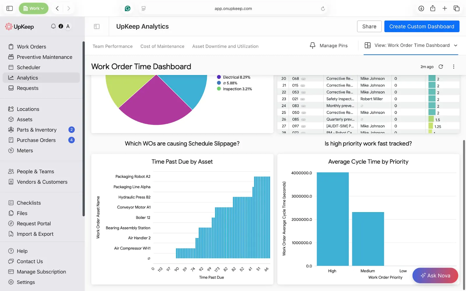
Time Past Due by Asset
Bar chart
Dimensions: Work Order Asset Name
Measures: Time Past Due
Average Cycle Time by Priority
Bar chart
Dimensions: Work Order Priority
Measures: Work Order Average Cycle Time (seconds)
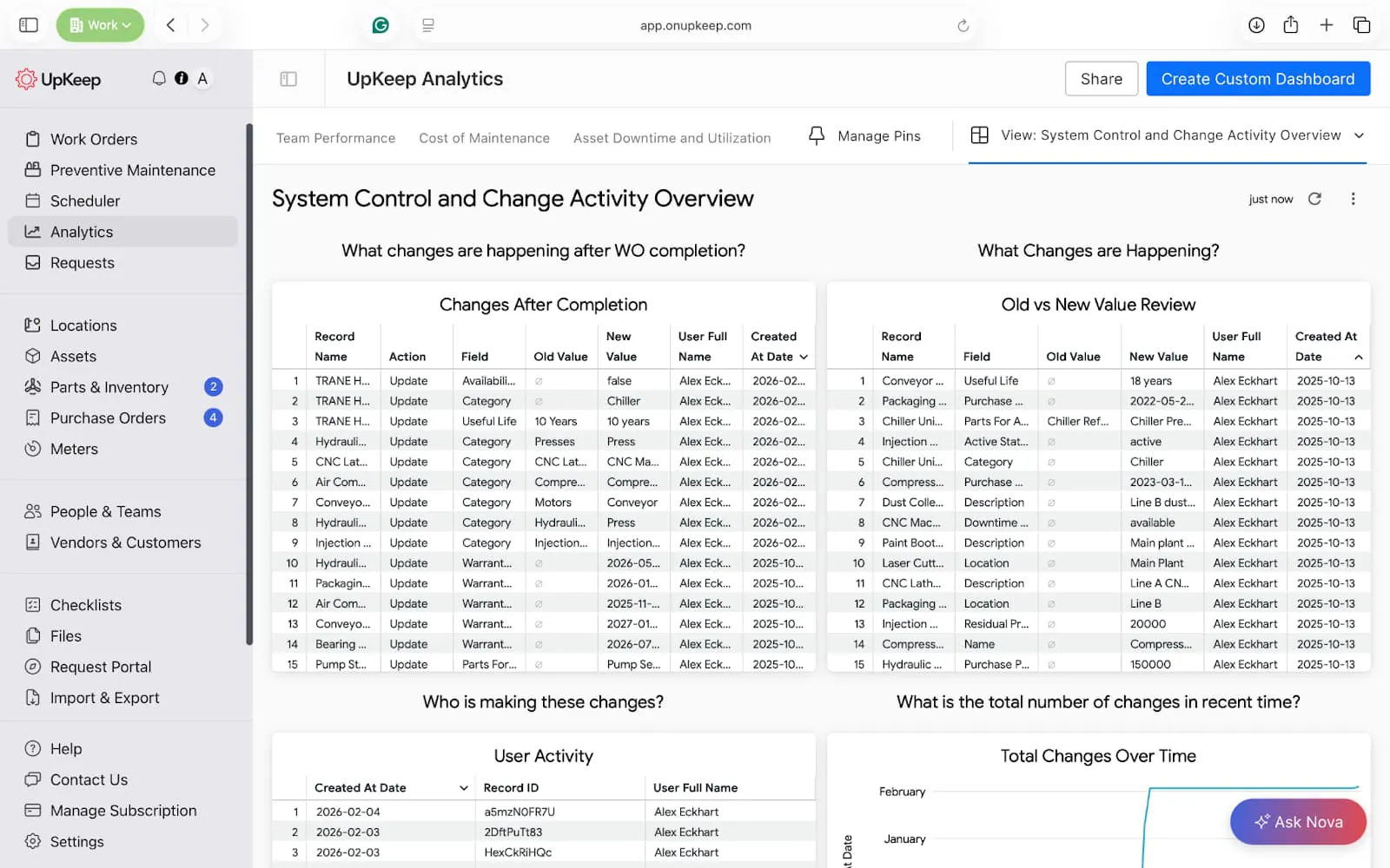
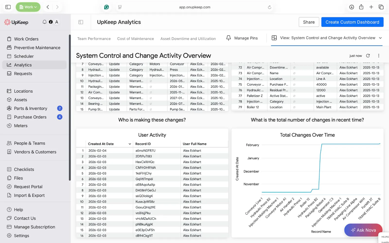
System Control and Change Activity Dashboard
This dashboard maintains tight control over changes in your maintenance software. It helps identify spikes in activity, detects abnormal behavior early, and keeps a strong audit trail for regulatory compliance.
Key reports: Changes after completion, Total changes over time
Manager’s Pro tip → Build this in UpKeep Analytics
Changes After Completion
Table
Dimensions: Record Name, Action, Field, Old Value, New Value, User Full Name, Created At Date
Filters: Action = Updated, Field ≠ Description (optional noise reduction)
Old vs New Value Review
Table
Dimensions: Record Name, Field, Old Value, New Value, User Full Name, Created At Date
User Activity
Dimensions: Created At Date, User Full Name
Measures: Count (Record ID)
Total Changes Over Time
Dimensions: Created At Date
Measures: Count (Record ID)
Filters: Record Type ≠ Audit Trail (if needed), Date range (last 30 / 90 days)
Optimize your Operations with UpKeep CMMS Dashboard Features
UpKeep CMMS dashboards transform maintenance into a strategic operation by centralizing real-time data for assets, work orders, and inventory. These visual interfaces provide immediate visibility into critical performance metrics. Specialized dashboards for task scheduling, preventive maintenance, and labor tracking help managers reduce unplanned downtime and optimize team productivity.
The platform also offers advanced analytics through custom tiles and AI-powered Nova prompting, generating instant visualizations from natural language queries.
Since its inception, over 4,000 maintenance teams have used UpKeep’s capabilities to demonstrate ROI to leadership and maintain audit-proof compliance records.
Are you ready to take your maintenance to the next level? Get Started Now!
Frequently Asked Questions about CMMS Dashboards
What is the difference between a CMMS dashboard and a CMMS report?
A dashboard provides a real-time, visual snapshot of current operations (like a car’s speedometer), allowing for immediate tactical decisions. A report is typically a static document that provides a deep dive into historical data over a specific period, used more for long-term auditing and forensic financial analysis.
Can I collaborate on dashboard views with other team members?
Absolutely. Collaboration features in modern CMMS dashboards enable teams to share insights, align on priorities, and work from a common set of data sources. Most platforms allow users to share their customized dashboard views with colleagues, granting either view-only access or full editing permissions, based on roles and needs.
How does mobile access to CMMS dashboards improve maintenance operations?
Mobile access to CMMS dashboards fundamentally changes how maintenance work gets done by bringing real-time operational visibility directly to where the work happens. Technicians can view their work queues, access asset history, update job status, and capture photos of equipment issues without returning to a workstation, reducing administrative time and improving data accuracy.
4,000+ COMPANIES RELY ON ASSET OPERATIONS MANAGEMENT
Leading the Way to a Better Future for Maintenance and Reliability
Your asset and equipment data doesn't belong in a silo. UpKeep makes it simple to see where everything stands, all in one place. That means less guesswork and more time to focus on what matters.